Let’s be real — posting random stories with no flow or vibe? Feels like throwing spaghetti at the wall. You’ve got great content, but it’s missing that polished, scroll-stopping spark. And don’t even get us started on the awkward cropping and cluttered text.
The truth? People judge your story layout in seconds. If it doesn’t look clean, cohesive, and a little bit curated, they’ll tap right past. You don’t need to be a graphic designer to fix that — you just need the right layout ideas.
This post is packed with 14 layout styles that will instantly level up your story game. Whether you’re promoting a product, sharing daily vibes, or announcing a drop — there’s a design here that fits.
We’re talking balance. Breathing room. Visual rhythm. Each layout idea is crafted to help your stories feel as good as they look.
Ready to stop winging it and start posting with purpose? Let’s dive in.
Read More: 11 Aesthetic Insta Story Ideas to Make Your Profile Stand Out
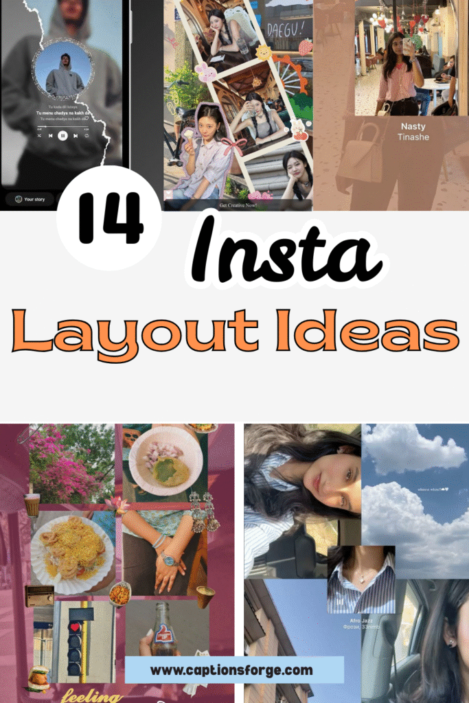
The Secret Sauce: 14 Story Layouts That Work
Before you start dragging photos into Canva or picking random fonts in Stories, pause.
A layout isn’t just where things go — it’s how your content breathes, flows, and hooks attention. When done right, a good layout turns even simple moments into share-worthy visuals.
Below are 14 Instagram Story layout ideas you can actually use — for promotions, daily content, or just aesthetic consistency.
Each one is designed to stop the scroll, match your brand energy, and make your Stories feel intentional.
You Might be Interested in: 11 Insta Story Selfie Ideas for Stunning, Flawless Shots
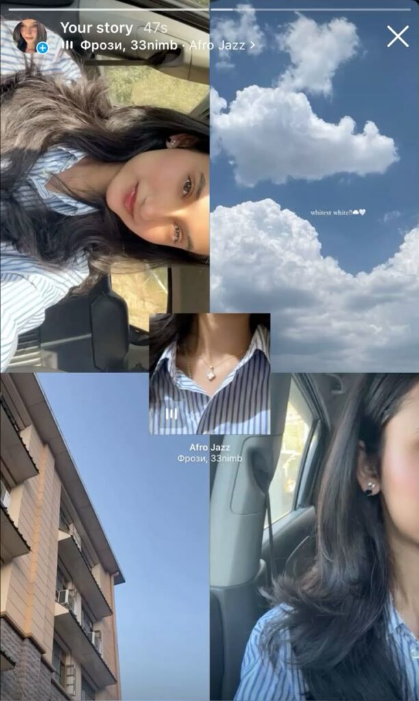
Grid-Collage with Mood Layers
 Download Image
Bold visual storytelling meets subtle emotion in this collage-style layout. The composition leans into asymmetry, creating movement with every cropped edge. Each frame brings its own tone — a soft selfie, serene clouds, sharp architecture — but together they pulse with cohesive energy.
Soft light and muted blue tones tie the images into one aesthetic moodboard. The repetition of the striped shirt acts like a visual anchor, pulling the eye across the layout without needing text to explain. It’s a masterclass in non-verbal narrative.
Negative space plays a smart role here. The open sky and cloud shots give breathing room between more intimate moments, like the necklace close-up and profile portrait. It prevents visual overwhelm while adding rhythm.
Nothing about the grid feels overly manicured, and that’s the magic. Edges overlap slightly and frames aren’t perfectly aligned — yet it feels intentional, not chaotic. It mirrors how memory works: layered, unpolished, but emotionally rich.
Perfect for story recaps, morning routines, or soft product storytelling, this layout invites pause. It slows the scroll by rewarding detail — from the subtle earring glint to the tiny text floating in the clouds.
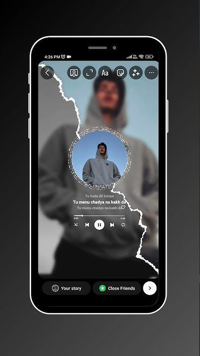
Torn Frame Music Visual
 Download Image
Striking visual contrast gives this layout instant edge. The torn paper overlay acts as a textured divider, drawing the eye straight to the center without relying on heavy graphics. It feels rebellious but refined — ideal for storytelling with emotional depth.
The circular photo frame surrounded by song lyrics creates a spotlight effect. It’s moody, personal, and cinematic — making the viewer feel like they’re peeking into someone’s private moment. Perfect for music shares or vibe-led story posts.
Layered blur in the background deepens the focus on the center subject. That soft, almost ghostlike duplicate enhances the dreamy atmosphere without distracting from the content. It’s subtle but incredibly effective.
Typography is minimal and intentional. Lyrics are centered beneath the circle and paired with clean icons for playback. This keeps the design functional without compromising the aesthetic.
Black and grey tones offer a sleek, modern finish. The monochrome palette enhances the emotional tone while keeping everything cohesive and easy to read.
This layout is perfect for sharing a favorite track, showcasing a solo shot, or building a moody vibe. Every detail — from the torn texture to the soft blur — adds layers of emotion and layout finesse.
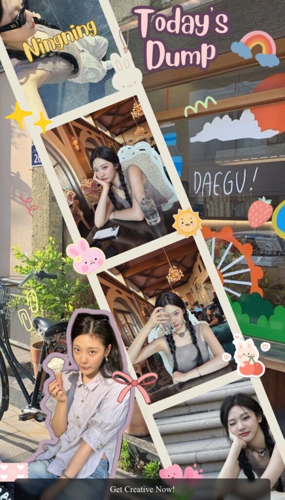
Playful Photo Dump Collage
 Download Image
Energetic and bursting with charm, this layout brings a playful twist to the classic photo dump. The diagonal photo arrangement keeps the layout dynamic while avoiding chaos — each frame is thoughtfully rotated just enough to add movement.
Decorative stickers and pastel doodles enhance the mood without overwhelming the visuals. Characters like bunnies, bows, and rainbows create a soft, nostalgic vibe that feels scrapbook-inspired yet trendy.
Typography plays a central role in tone-setting. “Today’s Dump” in bold, rounded font immediately signals a casual, daily-life vibe. Paired with hand-drawn elements, it feels personal and curated at the same time.
Consistent lighting and outfit tones unify the collage. Despite the range of scenes — ice cream moment, city walk, restaurant table — the photos blend well thanks to a soft, warm palette and natural daylight.
Visual hierarchy is smartly handled. Larger central images draw focus, while edge frames act as fun accents. No element fights for attention, even with all the layering.
Perfect for showcasing everyday snapshots with personality, this layout invites viewers into a fun, carefree moment. It’s storytelling that feels effortless — but every sticker and angle is working hard behind the scenes.
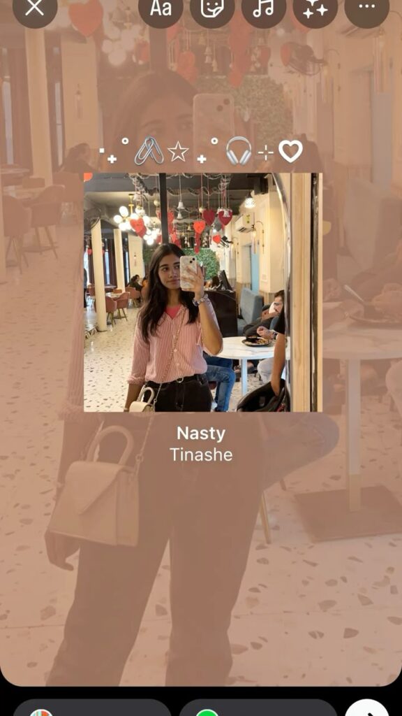
Mirror Shot with Music Overlay
 Download Image
Confident and clean, this layout shines through its minimalism. The mirror selfie takes center stage, framed tightly to keep the composition personal and direct. Adding a blurred background layer of the same photo creates instant depth without extra elements.
Smart use of text placement grounds the design. The song title and artist sit subtly at the bottom, giving the story a musical vibe without overpowering the visual. It’s the kind of layout that feels like a quiet mood — strong, but unbothered.
The top section balances with a string of icons, adding a hint of personality. They act like visual punctuation — decorative, not distracting — and keep the story from feeling too static.
Soft, muted tones in both outfit and café interior help everything blend. No color clashes, no over-editing — just natural hues and clean framing doing the work.
This layout is ideal for solo aesthetic moments: a mirror pic, an outfit flex, or even a cozy café check-in. It gives space to the subject while letting the music bring extra emotional context.
There’s no rush in this layout — it lingers. And that calm, centered feeling is what makes it scroll-stopping.
Vintage Street Diary Grid
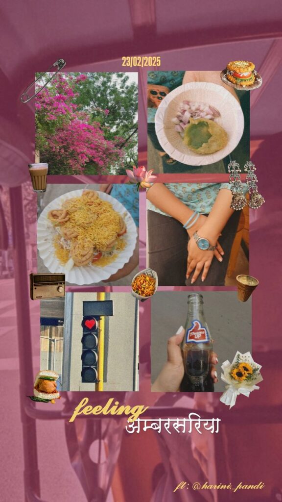 Download Image
Nostalgia oozes from every frame in this curated collage. The layout takes the form of a loosely structured grid, where each photo feels like a memory clipped from a summer day — food, flowers, hands, and heart signals from the street.
Every element leans into texture. From grainy filters to matte tones, the visuals evoke the feeling of old prints or scrapbook polaroids. The pinned chai cup, earrings, and lotus add personality, giving the layout an analog-meets-digital moodboard feel.
Spacing between images is tight but intentional, letting each shot coexist without strict alignment. That messiness works here — it mimics the rhythm of a real, lived-in day, making viewers feel like they’re flipping through someone’s memories.
Typography placement at the bottom feels poetic. “Feeling अंबरसरिया” in dual script gives cultural weight, while the soft yellow and white hues blend harmoniously with the warm background. It’s personal, expressive, and non-commercial.
The date stamp and “ft: @harini_pandi” bring a documentary style to the story. It’s not just a collage — it’s a moment in time, packaged like a page from a zine.
Ideal for travel diaries, food explorations, or cultural mood posts, this layout wins by being raw and romantic at the same time.
Soft Focus Vertical Story Reel
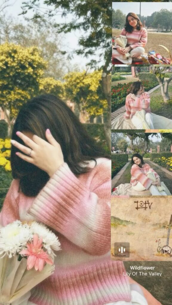 Download Image
Warmth and serenity radiate from this layout, built around a large central image with a vertical sidebar of supporting shots. The structure mimics a magazine spread — feature portrait on the left, editorial cut-ins on the right.
Color harmony is the standout strength here. Pink gradients in the sweater, floral bouquet, and skin tones flow gently across all five frames, making the collage feel like a single mood wrapped in light. There’s cohesion without feeling repetitive.
Negative space plays a subtle but crucial role. The blurred green background and open air between the side images prevent the layout from feeling cluttered. Each photo breathes, giving the viewer time to absorb.
The inclusion of the song tag at the bottom adds atmosphere. “Wildflower” ties in thematically with the visuals — it’s not just music; it’s a storytelling tool, anchoring the soft visual narrative in sound.
Strategically stacked images on the right keep the layout scroll-friendly and mobile-optimized. They’re aligned cleanly, offering a side reel of expressions and moments without disrupting the dreamy tone.
Perfect for soft outfit reveals, emotional moments, or garden shoots, this layout blends personal storytelling with visual poise — effortless, tender, and calming.
January Dump Moodboard
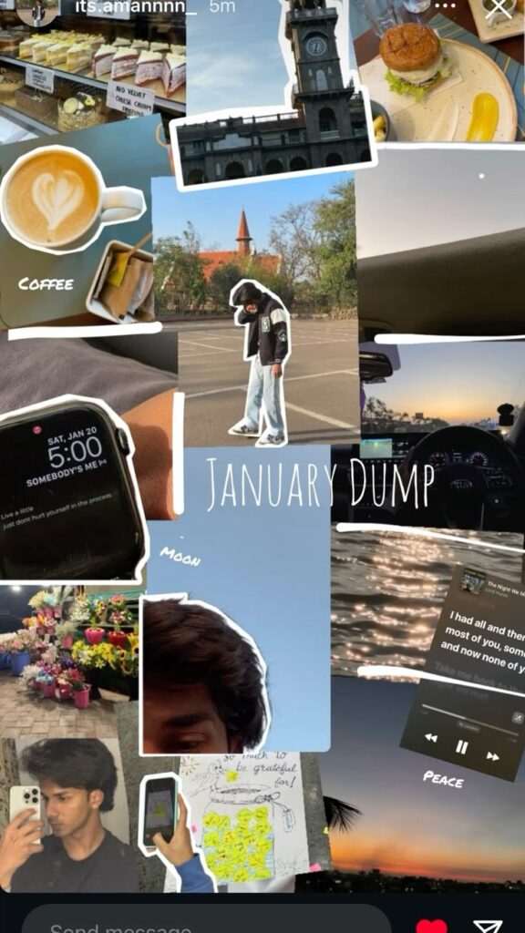 Download Image
Vibrancy and spontaneity drive this visual diary layout. The design feels like a mental scrapbook — raw, fast-paced, and emotionally layered. Every frame is outlined with sketch-like white strokes, adding a playful, cut-and-paste scrapbook effect.
The image placement rejects symmetry in favor of movement. Polaroid-style layering and unpredictable angles mirror the randomness of real memories. There’s no strict alignment, yet the layout flows naturally across the screen.
Handwritten text like “Coffee,” “Moon,” and “Peace” softens the overall tone. These captions feel personal, almost like labels in a journal. Combined with the visible timestamps and messages, it becomes more than a photo dump — it’s a peek inside a mindset.
Color contrast is well-handled despite the collage’s density. Warm browns, soft blues, and grayscale tones bounce off each other to create visual rhythm without chaos. Nothing feels oversaturated or over-edited.
Musical overlays and lock screen quotes add mood depth. Those touches make this feel more emotional than aesthetic — it’s not just what happened, but how it felt. It’s storytelling powered by moments, not perfection.
This layout is perfect for memory recaps or end-of-month vibes. It captures both randomness and intention in one scroll-worthy frame.
Audio Card Carousel on Cloud
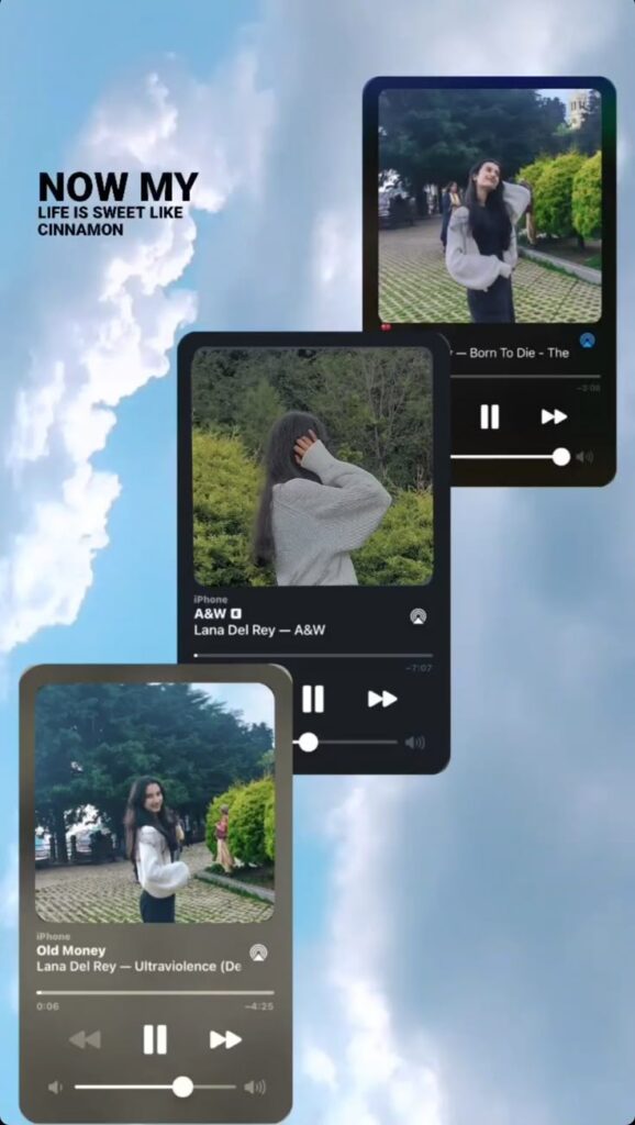 Download Image
Dreamy minimalism meets digital storytelling in this layered layout. Three faux audio cards float against a pastel sky, giving the illusion of album covers mid-air. It’s cinematic, yet lightweight — like flipping through a moody playlist in story form.
Each card features a matching pose and vibe, shot in the same location but framed uniquely. That repetition with variation keeps the visual tight while still offering dimension. The central figure becomes a character, not just a subject.
Typography is clean and purposeful. Song titles and artist names mimic iPhone’s native music interface, grounding the dreamy visuals with a familiar, tactile touch. It plays with both emotion and recognition.
The gradient shadow and stacking order create depth. Nothing sits flat — each audio card subtly overlaps the other, enhancing the feeling of a real-world flip-through.
“NOW MY LIFE IS SWEET LIKE CINNAMON” anchors the whole layout with lyrical flair. It’s bold, yet offset by the calm blues behind it. Every element supports the tone: wistful, aesthetic, and just a little Lana Del Rey-coded.
Perfect for music lovers, playlist recaps, or moodboard-style storytelling, this layout turns personal style into an immersive, melodic moment.
Polaroid-Stacked Mirror Montage
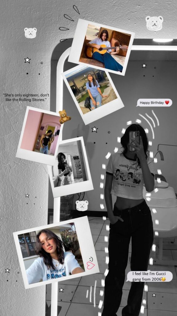 Download Image
Retro meets attitude in this punchy layout. A monochrome mirror selfie anchors the scene while vibrant polaroid-style snapshots orbit around it, creating a frame-within-a-frame effect that’s nostalgic yet modern.
Each photo pops with personality, and their casual tilt adds just enough chaos to feel real. The playful layering mimics old-school bulletin boards — messy, expressive, and totally intentional.
Black-and-white background keeps focus locked on the polaroids. It’s a visual power move, stripping away distractions while letting color memories do the talking. The contrast is sharp, graphic, and instantly eye-catching.
Speech bubbles and quote overlays add character-driven energy. “Happy Birthday ❤️” and “Gucci gang from 2006 😤” read like inside jokes — turning this layout into a personal narrative, not just a photo drop.
Scribbles, stars, and teddy bear doodles soften the layout’s edges. They add a zine-like feel that balances bold with cute. Everything feels curated with care but still playful enough to stay cool.
Perfect for birthdays, throwbacks, or character collages, this layout turns a mirror pic into a story — stylish, sassy, and memory-soaked.
Vertical Strip on Coastal Canvas
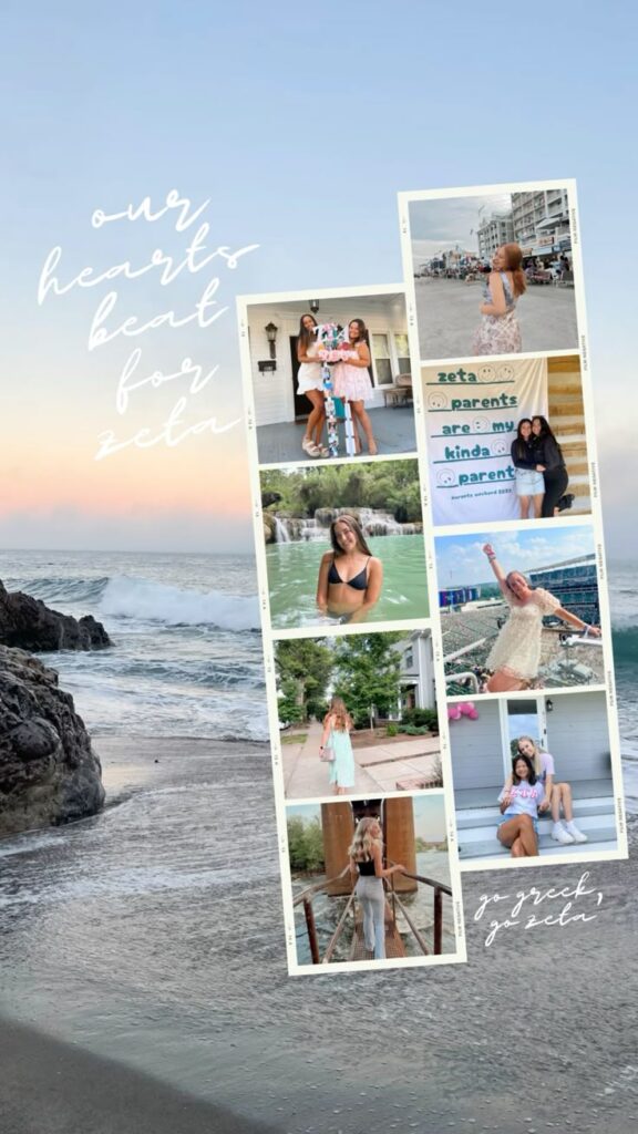 Download Image
Elegance and unity define this layout’s calm yet purposeful design. A vertical collage strip holds eight evenly spaced snapshots, floating over a dreamy beach background that instantly softens the visual tone.
Muted pastel tones across the photo set maintain cohesion, with outfits, water, and sky all echoing a breezy, carefree vibe. There’s no clutter or abrupt contrasts — the palette breathes harmony.
Text placement is effortless and poetic. “Our hearts beat for Zeta” and “Go Greek, go Zeta” are handwritten-style overlays that blend seamlessly into the oceanic backdrop, giving the layout a soft-spoken charm.
Photo spacing within the collage column is clean and consistent. There’s enough margin to prevent visual crowding, but the narrow alignment also keeps focus tight on the memories being shared.
Framing the photos in filmstrip-style borders adds a retro-sorority scrapbook feel. It elevates casual snaps into storytelling artifacts, blending modern digital design with old-school analog energy.
This layout is tailor-made for chapter recaps, summer break dumps, or recruitment season moments. It’s equal parts warm, polished, and full of spirit.
Soft Scrapbook with Floating Layers
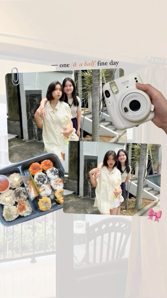 Download Image
Charming and effortless, this layout captures a candid day-in-the-life moment with a scrapbook-inspired twist. Light beige gradients give the background a cozy warmth, setting the tone before a single photo appears.
Floating frames break from grid expectations, overlapping just enough to feel playful. There’s no rigid structure — and that’s the appeal. Each image feels like a memory casually taped to a diary page.
Typography up top reads like a header in a journal entry: “one (& a half) fine day.” The italic accent adds personality, while the serif font keeps it polished. It’s storytelling through title alone.
Image textures stay soft and bright, making the visual flow smooth and inviting. Neutral outfits and natural daylight help everything blend without becoming flat or overly edited.
Tiny clipart elements — like the Instax camera and paperclip — bring out a DIY vibe. These details don’t just decorate; they amplify the layout’s nostalgic, analog energy.
Ideal for casual outings, food diaries, or quiet weekends, this layout feels like a hug in visual form — tender, honest, and gently styled.
Torn-Edge Glam Portrait Stack
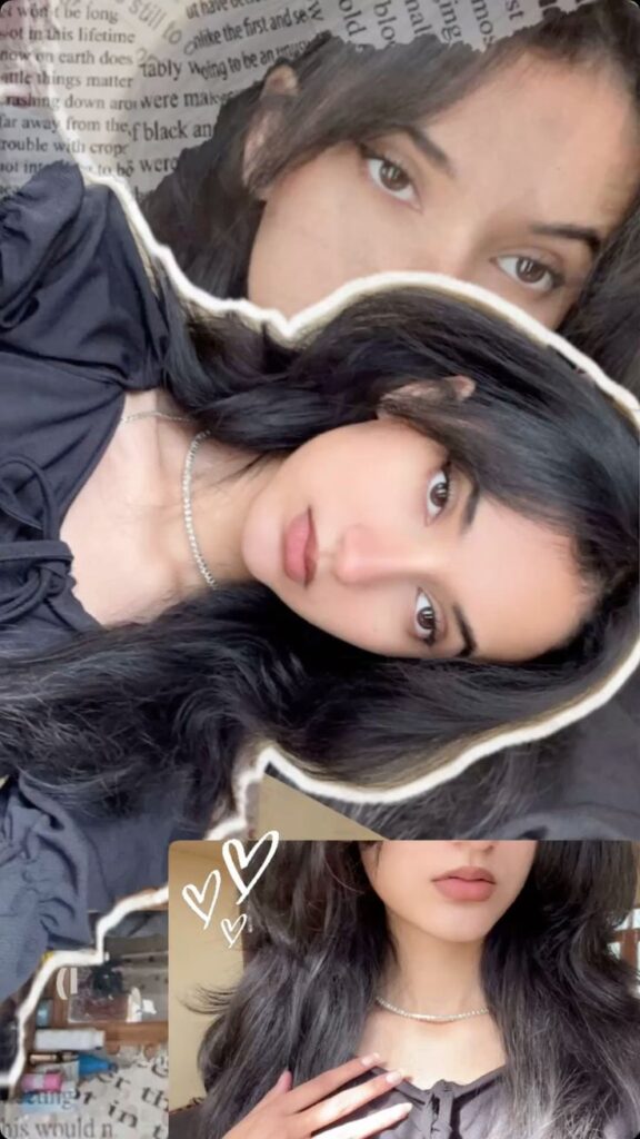 Download Image
Drama and softness collide in this layered, editorial-style layout. Torn paper edges give the photos a tactile, magazine cut-out feel — adding depth and texture that instantly elevates the standard selfie format.
Focus is everything here. The central image locks in with sharp eyes, strong lighting, and subtle shadows that sculpt the face. It demands attention without needing loud color or text.
Black-on-black styling creates contrast through form, not hue. The draped fabric, glossy hair, and minimal jewelry work together to amplify elegance while maintaining a moody, personal tone.
Overlaying the close-up eye shot in the background adds intimacy. It pulls you closer — a quiet moment that balances the layout’s visual strength with emotion.
Hand-drawn white hearts and subtle type fragments offer soft counterpoints. They flirt with whimsy without undercutting the layout’s high-fashion mood.
Ideal for beauty edits, soft glam looks, or poetic mood posts, this layout merges rawness with polish — scrapbook chaos meets runway composition.
Minimal Bloom Layer Stack
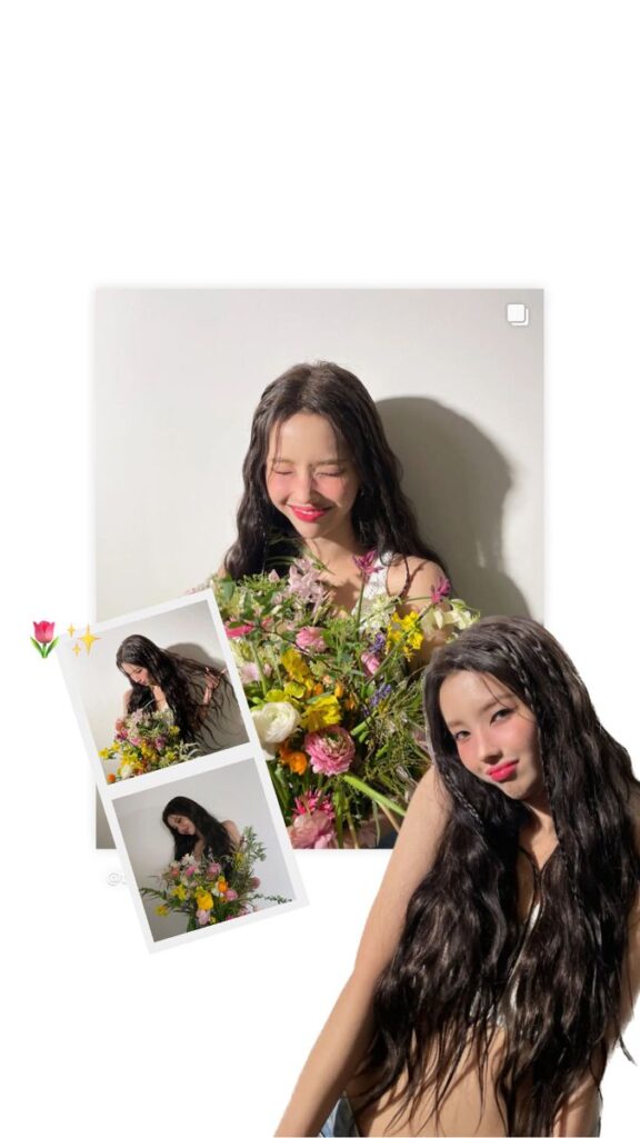 Download Image
Fresh and radiant, this layout bursts with energy without saying a single word. The pure white background lets every element breathe, giving center stage to the rich florals and glowing skin tones without distraction.
Layering is light and intentional. A main portrait anchors the top while tilted mini polaroids cascade diagonally to the left — creating a visual rhythm that feels playful but clean. The added cut-out pose at the bottom right adds movement, like the subject is leaning into the frame.
Color theory shines here. Vivid floral hues — pinks, yellows, oranges — explode against the neutral canvas, while soft lighting casts natural shadows that give each image weight and realism. Nothing feels flat.
Tiny doodles like the tulip and sparkles accent the frame without overpowering. They serve as sweet punctuation, not noise — adding charm and whimsy to the polished layout.
This layout is ideal for birthday posts, spring moments, or beauty highlights. It’s joyful, radiant, and subtly styled to feel both editorial and homemade.
Filter Moodboard Story Grid
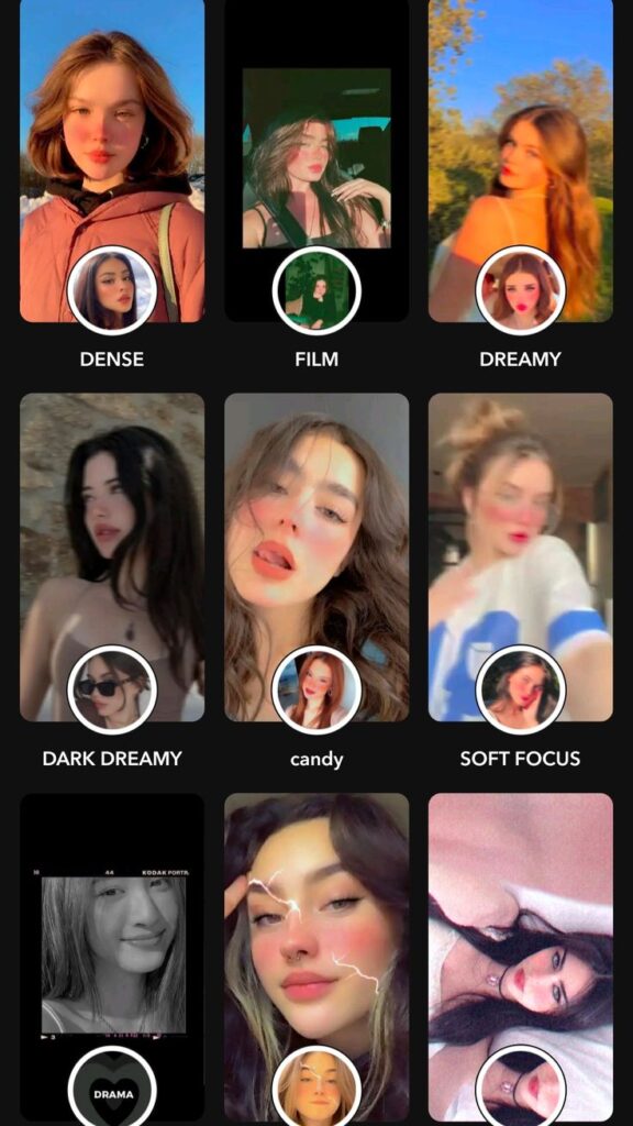 Download Image
High-impact and highly scrollable, this grid-style layout reads like a visual catalog of aesthetic identities. Each rectangular frame introduces a different vibe — from “DENSE” to “DRAMA” — creating a curated guide to moods through filters.
Consistent formatting across all nine frames keeps the design clean. Uniform circular insets at the bottom of each box act as a clever way to preview the original look behind the edit. This comparison technique adds both function and flair.
The black background anchors the entire grid, letting each filter’s color story pop without clashing. Saturated warmth, film grain, dreamy haze — every tone gets its own moment to shine without competing for space.
Typography placement is bold and smart. Labels sit neatly below each edit, using a simple all-caps font that keeps the focus on visuals. It’s editorial, organized, and easily digestible for fast viewers.
This layout isn’t just about beauty — it’s about options. It doubles as both a filter inspo board and a story template for creators to showcase versatility. Ideal for influencers, moodboard lovers, or anyone building a visual brand.
Wrapping Up: Insta Story Layout Ideas
Insta Stories aren’t just about what you post — it’s how you lay it out. From layered collages to dreamy filter grids, the right layout transforms everyday moments into aesthetic scroll-stoppers. Whether you’re feeling playful, poetic, or personal, there’s a structure that frames your vibe just right.
We’ve explored layouts that tell stories without words, highlight moods through music, and bring balance to chaos with creative spacing. The secret isn’t in flashy edits — it’s in intention. When your layout feels thought out, your story hits harder.
So next time you post, think beyond the photo. Think rhythm, flow, and feeling. Your feed deserves more than rushed uploads — it deserves layouts that speak your style.
Now go create something scroll-worthy.✨